

I Took MAYURA To Sephora And People Thought It Was A Brand Giveaway
Things can happen. You just have to do them.

We’re almost here. This week MAYURA became more tangible than ever before. I got my first full round of pre-production samples: three boxes with different design formats and layouts, along with labels for the bottles, which are finally in the right color.
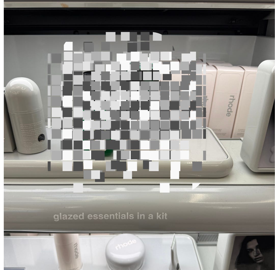
I took them to Sephora to see how they’d look on retail shelves. Two shoppers thought I was doing a brand giveaway. Is there any better validation than watching people assume MAYURA is already sold there?
A store associate asked if I needed a basket. Maybe she just saw me holding boxes and didn’t notice the design didn’t match anything on their shelves. But maybe the packaging just looks like it belongs.
While bopping around to different displays to see how MAYURA looked on shelving at different levels, in various types of lighting, I decided to get some feedback. Each time a shopper passed me, I asked: “Do you have a minute? I’m wondering which of these boxes appeals to you most. Or if you don’t really like them that much, you can be honest! It won’t hurt my feelings.”
I did this kind of field trip to Credo Beauty when my bottle samples arrived in my top two color choices. Every detail makes a difference.
Each time pre-production packaging samples arrive, I photograph them in my home. Near my window on the dining table, where there’s natural light. In the bathroom, where there’s none. And in Sephora or Credo.
It’s not for my ego. It’s to make sure the logo is always readable in different types of lighting, that the finishes work and that the colors translate, whether the product is on an eye-level shelf, above or below.
That said, I encourage anyone doing work with long lead times to soak it in when it becomes real.
Because these are pre-production samples, they’re not yet fully finished. I hand-affixed every label option to my glass bottle samples to figure out which one we want to go with — and how much or how little text we want on the front. I tested two layouts and three different formats of text.
I’m looking at everything: the thickness of the paper, whether the box feels flimsy or secure – the product is in a glass bottle, so security is even more important – what the experience is like when you pull it out of the box.
And then there’s another very practical reason to take your packaging to a new environment. At some point, after months of looking at the same thing, you must give your brain new stimulus so your eyes can approach this fresh.
When I was a reporter fact-checking lengthy features and investigations that took months or sometimes even a year, I’d print out a near-final draft. With a pen and highlighter, I’d read out loud and go over every single word. Two rounds: The first purely for fact-checking, word by word. A second round for readability, smoothness, and any typos I may have missed.
You won’t believe how many tiny things you’ll catch if you make your brain read something it is used to in a different way, even just out loud. By that point, I’d already read the story hundreds of times and made so many edits that this new format was critical.
Your eyes start to glaze over things you’re used to. New environments and formats take your brain out of autopilot.
That said…it was pretty sick to see MAYURA come to life in my actual hands and on shelves after 1.5 years.
More on the design process and the incredibly talented team that helped make it happen when it’s time for the packaging reveal. (The waitlist will be first to see and preorder.)
I can’t wait for the next time people say “Are you doing a brand giveaway?” and I can say: “Yes! Would you like a sample?”
Follow on Instagram and TikTok to see all the ways I put MAYURA to the test — including while learning how to surf in Puerto Escondido last week. (Just be nice about my noob wipeouts.)
And share the MAYURA waitlist with a curly/wavy friend who just wants to look good while doing things.